Scalable tokens for white-label theming
Turning partner customization into a systematic, accessible, and instant process.
Overview
As Onze scaled B2B partnerships, each new client required a customized app version. Without a token structure, implementation was manual, slow, and inconsistent. We led the creation of a design token architecture so the product could adopt any visual identity instantly and safely.
My role
Co-creation and implementation of token architecture in Figma (Design Ops & Systems).
Challenge
Implementation time for new partners was a business bottleneck. Without a single source of truth, rework was constant and ensuring WCAG accessibility across partner palettes was a QA challenge.
Impact
Time-to-Market
Drastic reduction in onboarding and visual implementation time for new B2B partners.
Built-in accessibility
100% WCAG compliance supported by token logic. We enforced contrast and accessibility in Figma using a dedicated plugin, which removed the need for manual contrast QA.
Operational scalability
System prepared to support hundreds of brands without increasing design or engineering headcount.
Full synchronization
Eliminated gaps between Figma and production, with Figma as the single source of truth.
Process
- 01
Audit and inventory
We mapped all existing color variables and styles, identifying standards and legacy clutter to clean the system before building the new architecture.
- 02
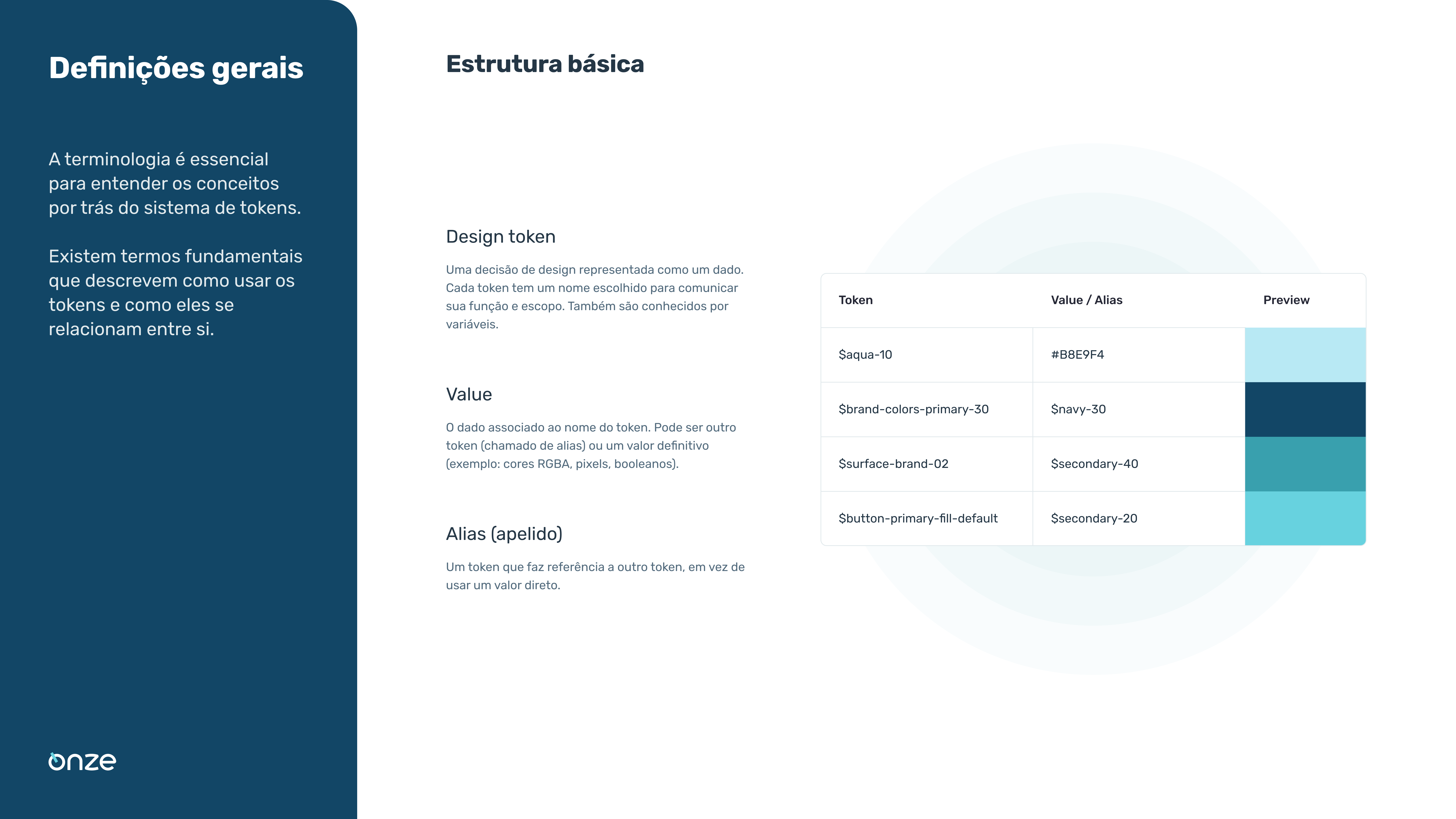
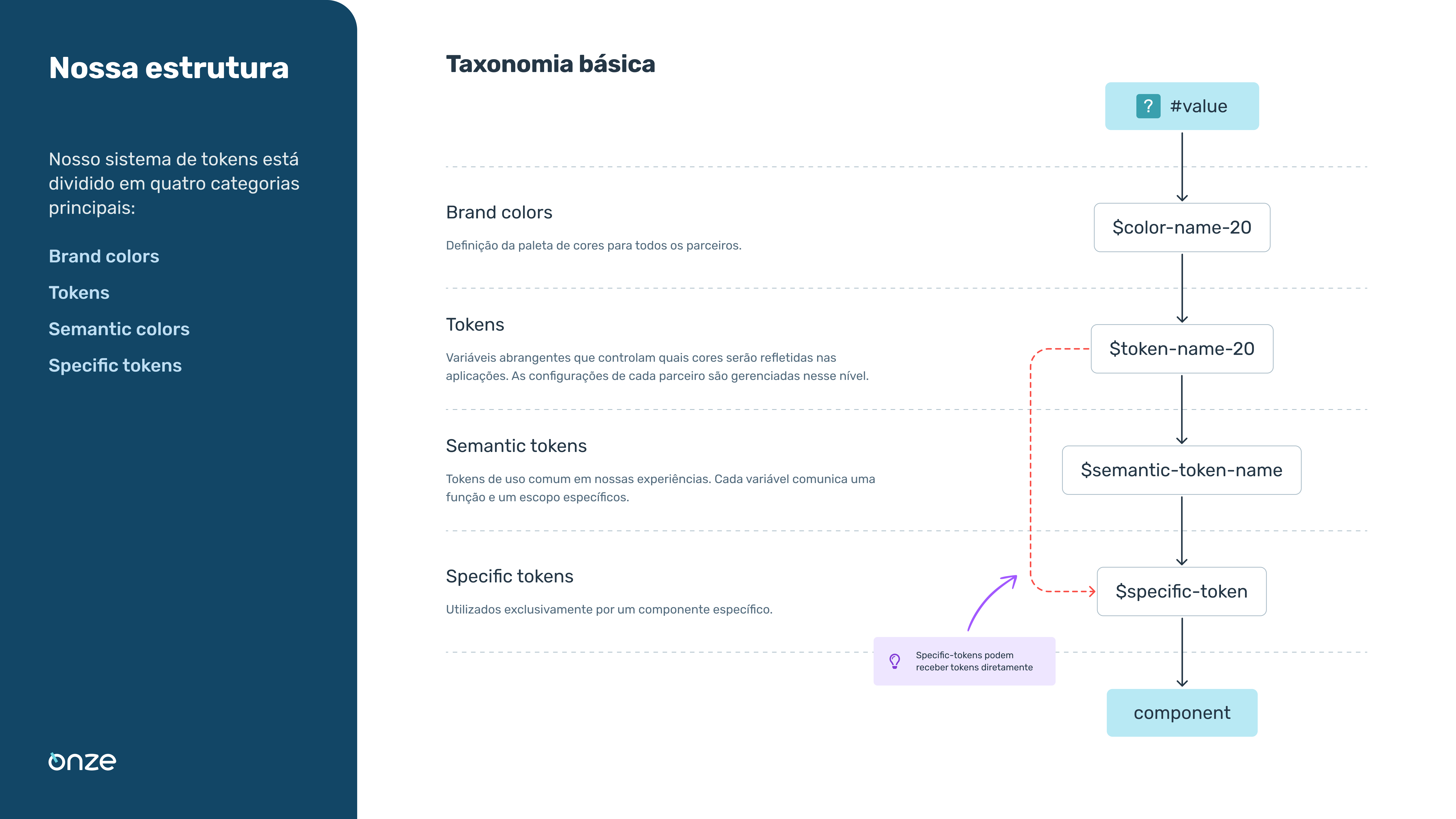
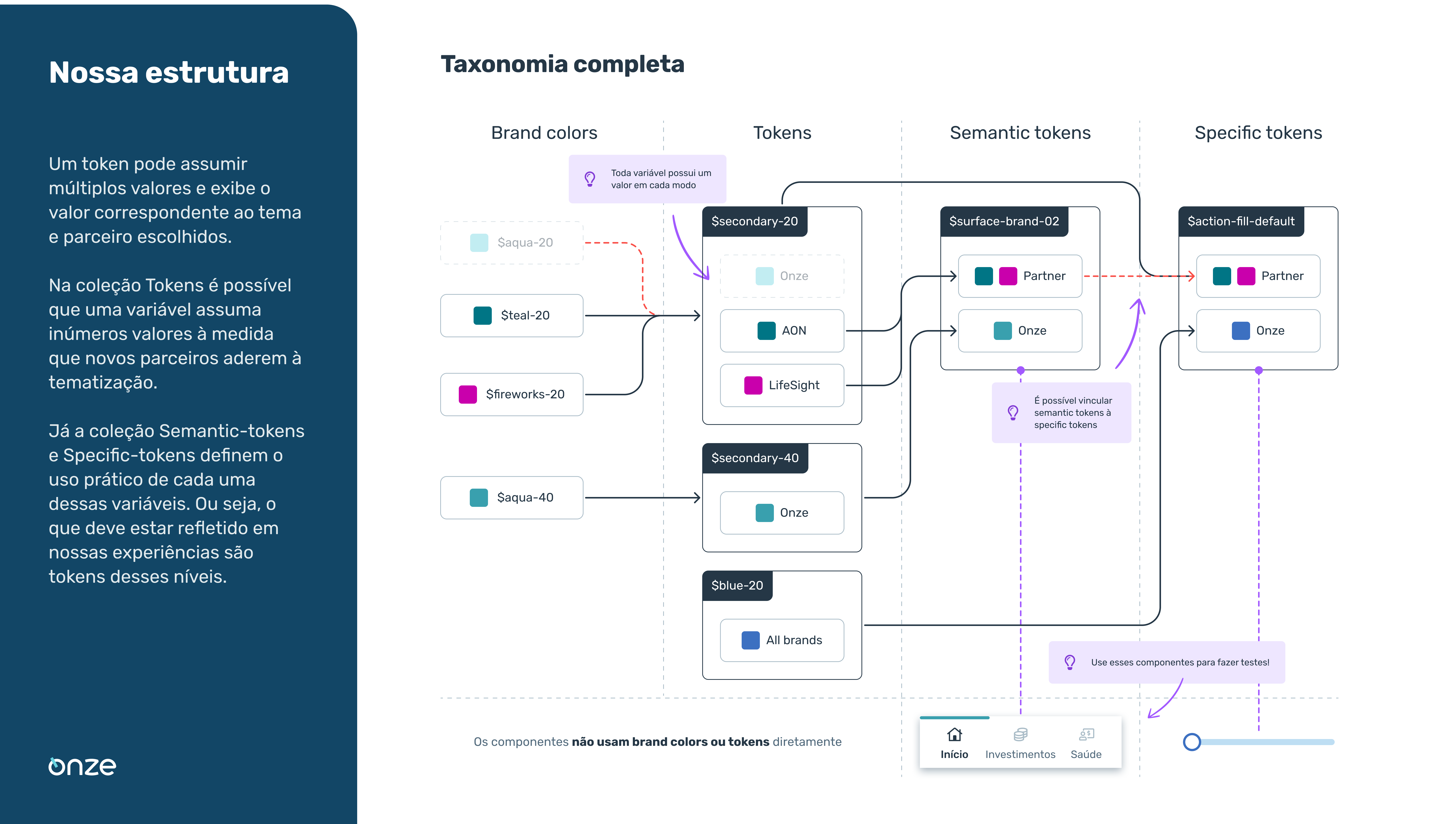
Three-layer architecture
We defined a three-level abstraction structure: Primitive Tokens (raw values such as
blue-500), Semantic Tokens (intent-based values such ascolor-action-primary) and Component Tokens (specific applications such asbutton-label-primary). - 03
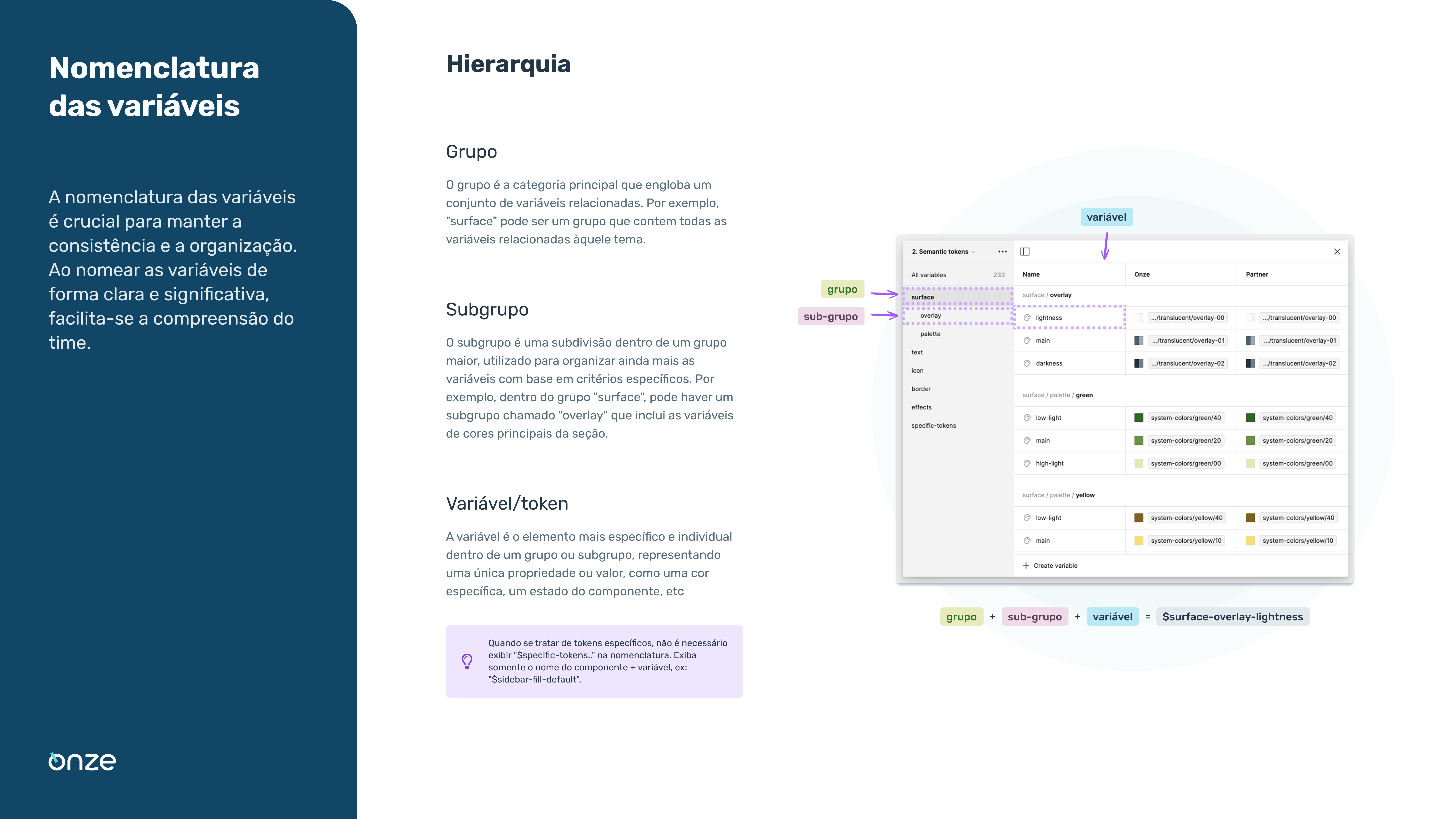
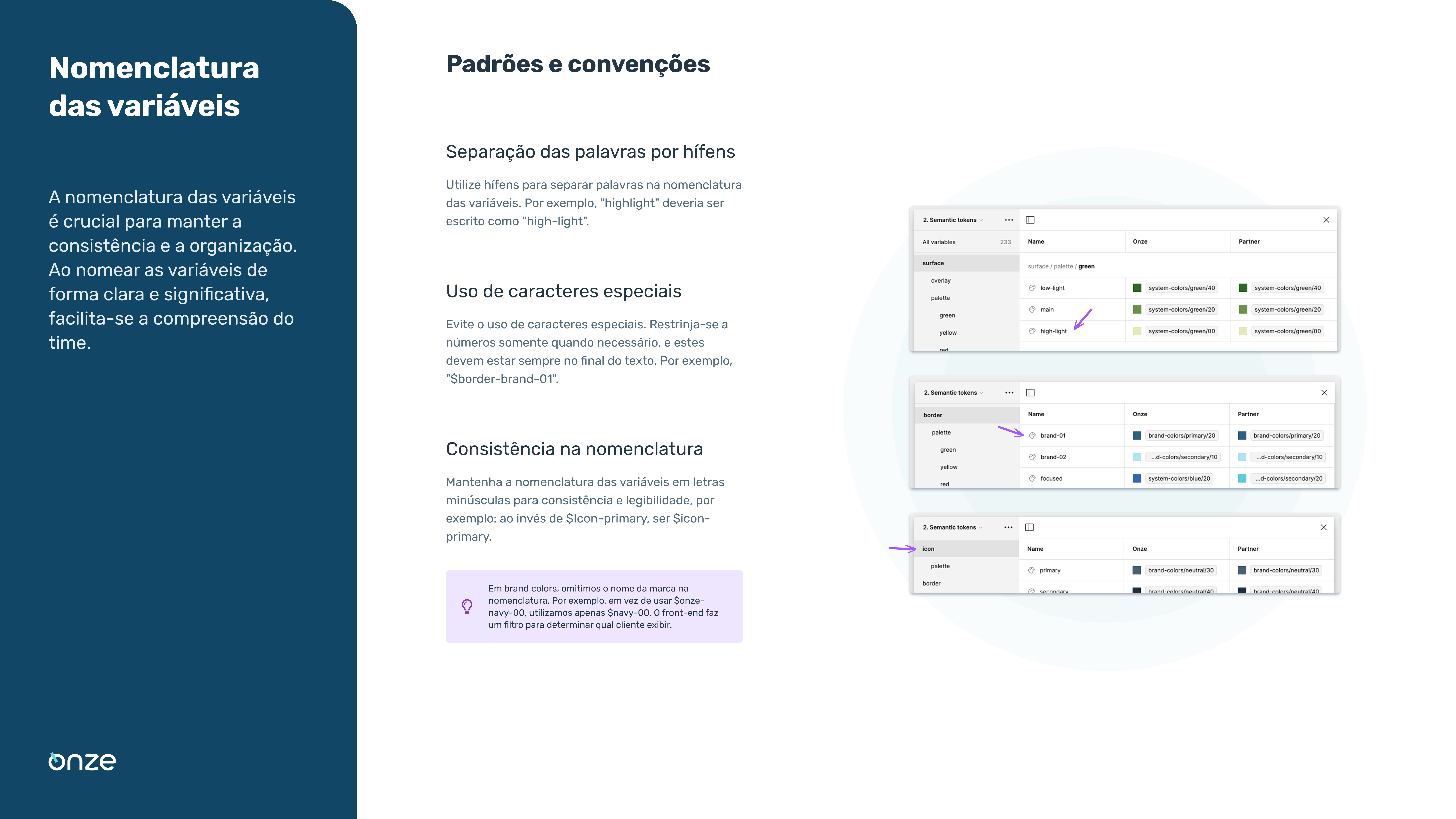
Taxonomy and naming convention
We established a semantic and predictable naming convention, allowing developers to consume tokens directly in code and reducing manual Figma inspection by 80%.
Gallery
Multi-brand palette
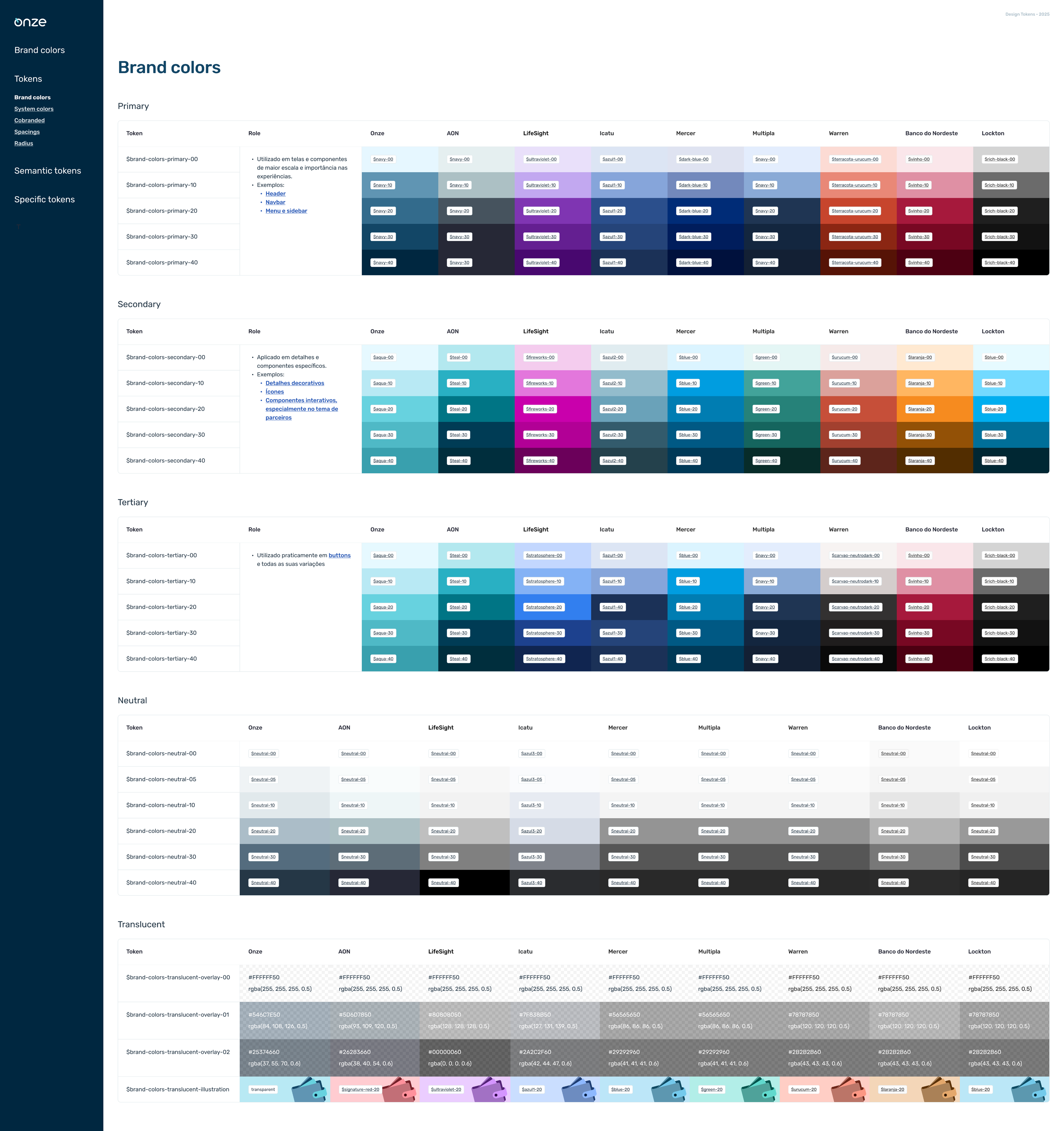
System structure
Variable naming
Solution
- Figma Variables & Styles: Native implementation in Figma, keeping design as the single source of truth for all partner brands with direct code sync.
- Automatic accessibility: Smart fallbacks ensure that if a partner color does not meet minimum WCAG contrast, the system suggests or automatically applies adjustments to keep text legible.
- Safe versioning: A system that allows global component updates (such as changing border radius on all buttons) without affecting each partner's brand colors.
- Governance documentation: A maintenance guide with clear rules for creating new tokens, ensuring the system does not degrade over time or with team turnover.
Key learnings
Naming is everything
A well-designed taxonomy saves more time than any visual polish. Language alignment with developers was the biggest gain of the project—when designers and engineers speak the same language, rework disappears.
Think in systems, not screens
Shifting the team mindset to "Design as Data" was key to the success of the white-label model. Tokens are not just a design solution—they are a product-engineering solution.
Governance is product
A Design System without maintenance rules becomes a component graveyard. Technical documentation is what ensured long-term value beyond the original project timeline.